I was asked to review a new lake booklet for a nonprofit. It starts with a description of what a watershed is and provides images (see below). When I looked at the image it struck me that there is likely no lake watershed on this planet that doesn't have some human disturbance and that we may want to have the image be more representative of what a real watershed looks like (roads, homes, ag ..) and one that more closely represents their watershed - not real busy but just a few icons or something. When I made the suggestion to the NGO contact she too had thought the same thing. When she questioned the design graphics and writer she pushed back and said something to the effect " that she thought it would clutter the graphic/concept and that we should stick with the chapter headings and keep the graphic about ecology and processes." Not being an expert on such things, I am wondering what the experts think. I worry that the wrong 'image' or message will get stuck in the mind of the reader because the disturbance in the watershed is the POINT/problem to nonpoint source pollution and we want people to know that this is where the problem comes from.
To be effective should the watershed image in the beginning of the booklet focuses on lake ecology in a prehumen condition and leave images of disturbance to later? (note there is no proposed watershed graphic later in the document but there are graphics with a shoreline perspective I have included those incase they help the discussion). Or should the first images contain disturbances/development like today's lake watersheds?
Thanks Kathy
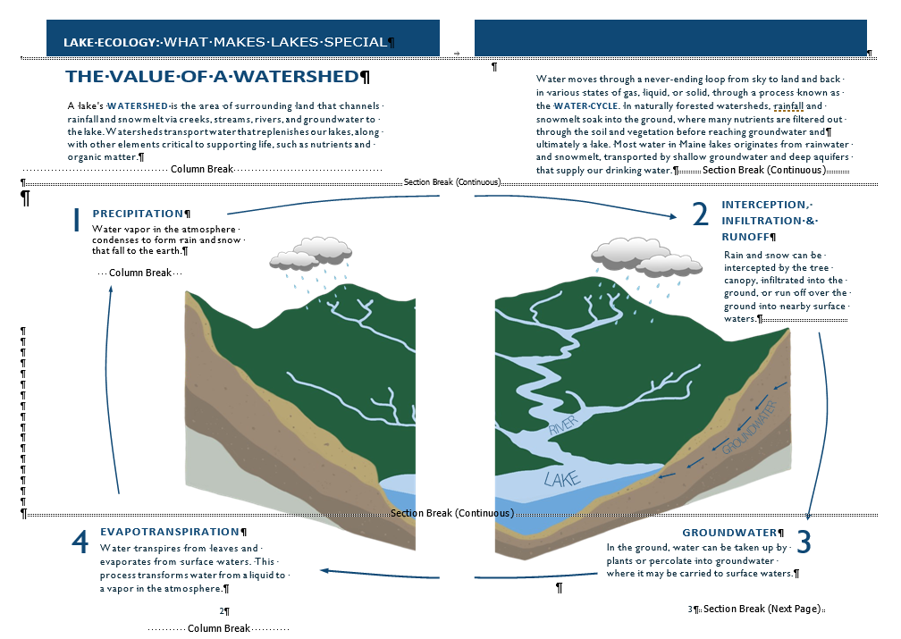
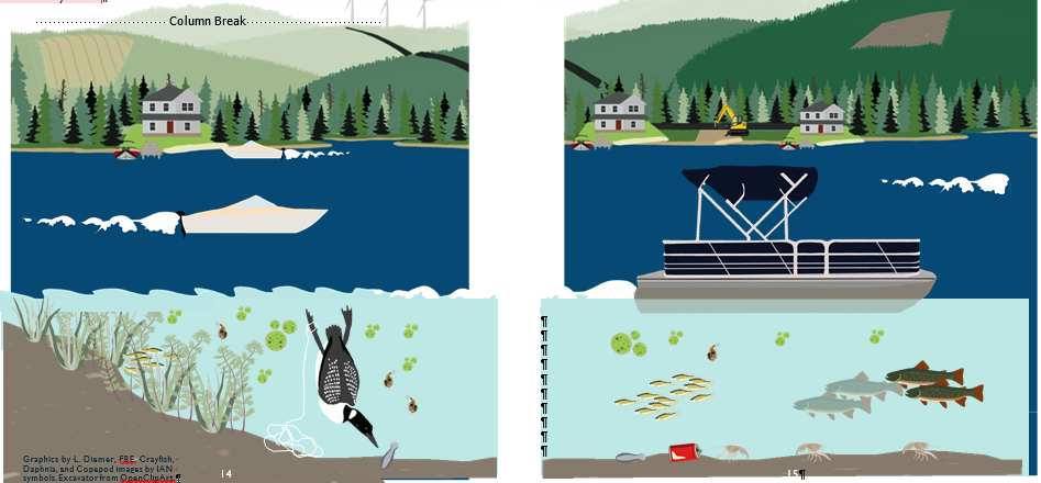
Watershed Image from section titled Lake Ecology what makes lakes special image.png233 KB Later in the booklet under the section titled Human Element our impact image.png360 KB
Good question! I am not an expert, but as a general person in the water industry, I do like the explanation of the watershed and image as it is. Because a watershed is so large, it makes it difficult to give a concrete example that is easy to grasp. The image is clean and to the point. I assume the educational objective is for children to be able to define a watershed. The image does support the definition.
As for the human impacts on a watershed, I think this image could be improved. The image makes it appear that the watershed is only the lake. The land around a lake may look like this, but it ignores the more congested area that also contributes to the watershed. I think of the non-point Enviroscope model: https://www.enviroscapes.com/product/watershed-nonpoint-source-model/hands-on-models. Can she create an image that shows impacts from a city flowing to a lake? (I am not an artist - for a reason - so I don't know how challenging this is to do with the space available.) Maybe she could add more on the hills? There can be circles at the points above on the hills that accompany text to the side to explain what the pollution is. For example, a dog could be in the image with a number corresponding to text about pet waste. Hope that makes sense.
...
Fostering Behavior Change Minute
Join over 15,000 subscribers who receive a free weekly newsletter from the founder of community-based social marketing, Dr. Doug McKenzie-Mohr.
Advertisement
Action Research offers a full range of community-based social marketing support services to agencies addressing health, safety, and environmental behaviors.
Good question! I am not an expert, but as a general person in the water industry, I do like the explanation of the watershed and image as it is. Because a watershed is so large, it makes it difficult to give a concrete example that is easy to grasp. The image is clean and to the point. I assume the educational objective is for children to be able to define a watershed. The image does support the definition.
As for the human impacts on a watershed, I think this image could be improved. The image makes it appear that the watershed is only the lake. The land around a lake may look like this, but it ignores the more congested area that also contributes to the watershed. I think of the non-point Enviroscope model: https://www.enviroscapes.com/product/watershed-nonpoint-source-model/hands-on-models. Can she create an image that shows impacts from a city flowing to a lake? (I am not an artist - for a reason - so I don't know how challenging this is to do with the space available.) Maybe she could add more on the hills? There can be circles at the points above on the hills that accompany text to the side to explain what the pollution is. For example, a dog could be in the image with a number corresponding to text about pet waste. Hope that makes sense.